


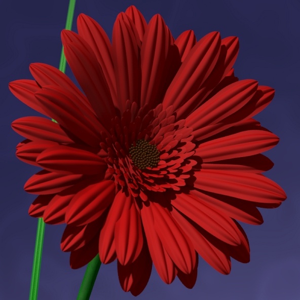
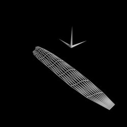
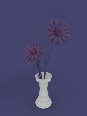
"Gerberas"
This image was made for a friend of mine, for which I didn't want to go the traditional way of giving flowers, but rather create a artwork which would last longer than a couple of days. Although she knew that I made digital art, she was uncertain if the small poster I gave her was a real photo or digital, adding much to the enjoyment I already had scripting it for her.
At the time this image was originally rendered, it required 5 days to render and pushed my PC to its limits with its RAM-consumption and processing load. Nowadays, a few hours on a Laptop is sufficient...
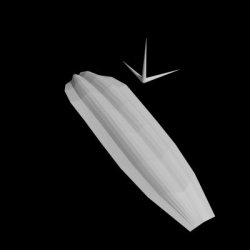
It is also featured in a german POV-Ray book called "3D-Welten", here's a link to Amazon.de.
Click on Images |
Index
Modelling
Modelling the objects in this scene was no easy task. With no actual modeller at hand (and being a POV Purist) I wrote some dozens of macros in order to generate meshes and alter them very easily.
The most significant thing one has to keep in mind is that meshes always create a facetted look unless enhanced with Phong-Shading. Phong-Shading actually applies surface-normals to each vertice of a triangle and interpolates these normals to simulate a slightly curved surface instead of a triangular plane.
The approach for modelling was similiar to conventional 3D-Modelling techniques. Using one or two splines as basis, I create an initial rectangular piece of mesh. Using my macros, this mesh was then altered and displaced, mostly with sine-waves, to model the different parts of the flower, the background and the vase.
Luckily I had some Gerberas at hand (bought them, actually) during the crucial modelling steps of the petals, otherwise they would have looked completely different.
There are a few things I won't cover in this section, mostly because its not easy to visualize and rather algorithmic stuff, like the placing of the petals and the seeds. But an image to show it off is available here.
The seeds and inner petals were positioned according to a nice formulae someone once pointed out in the povray-newsgroups. The link can be found here.
The outer petals were positioned and angle-adjusted with another macro I wrote. It actually memorizes the last few entries of angles and generates a new one which has a certain distance to the ones before. This should assure that petals don't overlap that much and in a too obvious manner.
And finally, both flowers are different, as each one is calculated with the use of a random-stream. If I'd traced 20 flowers, each and every one would be unique. This was implemented in case I'd need a Gerbera for mass-appearances, but mainly because I wanted to make sure that I'm using two different flowers in this image.
(If anyone's actually wondering: the background was just modelled by sweeping one spline along another. Nothing special, no deformations. Just sweep and use smooth-triangles. Thus no need for an extra section...)
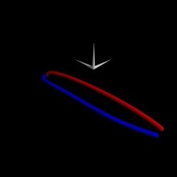
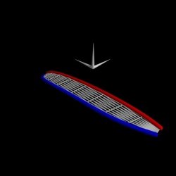
Modelling a Petal
The petal was modelled with two splines as base. Since the petal is symmetrical, I began with modelling one side, and then just mirrored it. Using Smooth-Triangles and a high enough interval-setting, the results are quite stunning, keeping in mind that I used mathematics for modelling, not a hands-on interaction modelling tool.


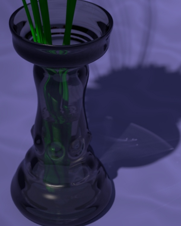
Modelling the Vase
The vase was modelled with a macro which takes one of my B.-Splines as input and rotates it around the y-Axis, similiar to the SOR- or the Lathe-Objects. I define an amount of detail of nodes on the spline and of subsections in the revolving process. The array I get was then altered with some sine-waves, adding "bumps" by translating certain nodes outwards according to the calculated surface-normals at those given nodes.
Image 1 - Pure B.-SplineThe modelling of the vase began with a simple bezier-spline I handcoded using a BSpline-Macro of mine. This would be going to be the base for a lathe-like object constructed as a mesh. |
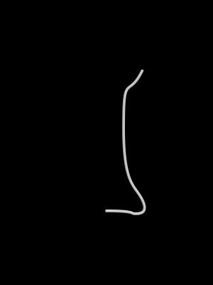 |
Image 2 - Lathed B.-SplineThis is a low-res version of the mesh, shown here as CSG with spheres and cylinders. The basic shape of the vase exterior hull is obvious. |
 |
Image 3 - Lathe enhanced with FunctionsInternally, the mesh is saved as a 2D-Array filled with vectors. Using the indices as value ranging from 0 to 1, functions and mathematical formulaes may easily be added to the structure. In this case, running upwards from the base to the top added different scales and frequencies of sine-waves. |
 |
Image 4 - Ordinary MeshUsing the same scale of detail, the external structure is too easily identifiable, and also misses some detailed structures in the middle. Just look at those obvious edges and corners! |
 |
Image 5 - Larger detail, ordinary MeshInternally, still using ordinary triangles, the shape looks much better at a detail level more than twice of the above (its actually 150 by 100 nodes here). Though not so obvious in such a small image, facettes are visible. |
 |
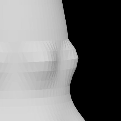 |
Image 5 - Close-UpClose up on ordinary mesh. Here you can easily spot the different triangles, an effect we don't really want in a near-realistic image. |
Image 6 - Smooth-TrianglesUsing smooth_triangles creates much smoother shadows, highlights and reflections on the mesh. On this scale, nothing hints at the vase being a mesh. |

|

|
Image 6 - Close-UpSame Section as in Image 5 Close-up. Using smooth_triangles, which interpolate surface-normals to simulate curved triangles, we can see a much smoother vase. The edges are still there, but the surface looks smoother. Taking care of the edges requires even more detail, but was not needed because of several options (focal blur, camera angle) which made it less obvious than seen here. |
Modelling Conclusion
There's not much to conclude from modelling. The main aspect you have in mind is the final look. You don't need to have tons and tons of detailed meshes, sometimes, a low-res/smooth_triangle-mesh, does the same job. The modelling techniques involved in the making of this image are actually less pure POV, but more conventional style, using meshes, spline-revolutions and spline-spline-connections. These are methods found in every 3D-Modeller.
POV-Gibberish
The meshes were constructed with various macros I wrote. Depending on what you want to achieve, you call the macro with a spline-setup, some parameters on detail, and out you get an array filled with vectors of positions for the nodes. Other macros are run across these arrays to add functions, calculate surface-normals for the smooth_triangles, or collect specific data (like the lowest y-value of a given mesh to assure it being placed on a surface).
Photon - Issues
Photons are a method of calculating real reflection and refraction of light. It is in fact a pre-processing step which shoots photons from lightsources onto objects, and thus traces the interaction of light and environment.
You actually need quite a lot of photons in a scene to get decent results, but the effect it has on an image is significant. Mirrors reflecting a beam of light through a room, diamonds sparkling with refraction... Its a really obvious and wide-spread "effect" in the real world, so its generally not a bad idea to use it if you're using glass or metal objects and hunger for appropriate light-interaction. In opposition to radiosity, photons do not significantly alter the appearance of an image, but "merely" add to it, and thus, no need to worry when you should use it during the modelling process of a scene. It may be added at any time, but you might want to take into consideration that you'll probably end up tweaking the scene a little to balance the new lighting effects.
Image 1 - No photonsThe final scene traced without complex textures, but instead only a pigment with white color. No finishes, no normals, no transparency. Look closely at the shadows... They're simply black. |
 |
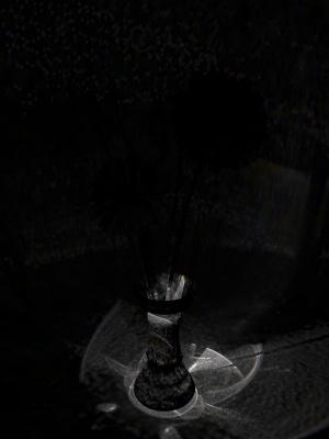
Image 2 - PhotonsThere are two places where you can spot the effects of photon-calculation very easily. One lies in the shadow of the vase, the other is on the vase, just underneath the upper rim. In the case of this image, just a subtle effect. |
 |
Image 3 - Pure photonsNote that the image is post-processed for better visibility. We can clearly see the amount of photons spread throughout the entire scene. The spots that were obvious in the above image show up as bright white areas, so a lot of photons are gathered there. Note, however, than many more photons are spread across the lower part of the image. |
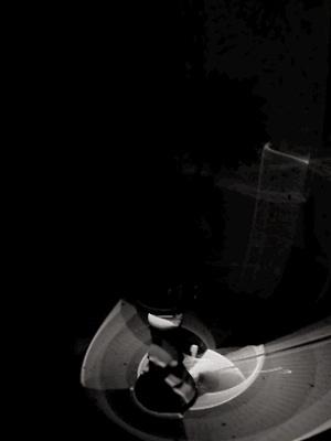 |
Image 5 - DispersionThere's not much to tweak when using photons, unless you use dispersion. Dispersion is a process used to simulate the break-up of light into its different wavelengths. This is done by shooting and storing colored photons, differently refracted according to their wavelength. Although the spacing used in this image is less detailed than in the original images, we have nearly the same amount of photons in scene, but nontheless artifacts show up. |
 |
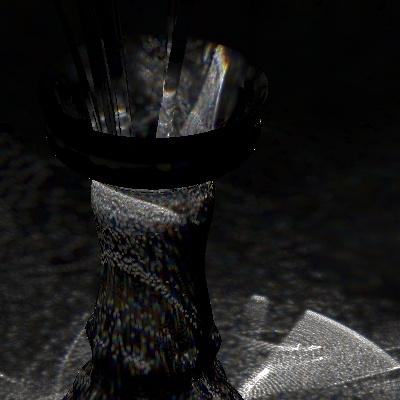 |
Image 5 - Close-UpClose up on dispersion photons. Notice the colorbanding, which is the effect you actually wish to achieve with dispersion. On the other hand, you get widespread dots and banding of photons. Though almost the same amount of photons is present in scene, the rainbow colors are achieved by splitting each photon, which hits an object, into 30 colored photons. So lighting detail is lost even though we have the same amount of photons in the scene. In order to achieve a quality-level near the one I had without dispersion, I would have needed more RAM (I reached its limits with the quality I picked for the non-dispersion photons, so...). |
Photons Conclusion
The impact photons have on an image depends on the objects in scene. Glass refracts and metal reflects light, so it will enhance the look of those materials and their effect on other scene-objects for sure. In this image, most of the actually visible change lies within the shadow of the vase, and due to the stems of the flowers, a lot of photons are stopped. Nontheless, photons add a distinct touch of realism.
POV-Gibberish
There's not much to be added to the POV-Aspect: I used a spacing of .0005 in the final trace, which resulted in a data-file with over 40 Millions of photons stored. Note that the results are more realistic the smaller the spacing is (or the higher count is), but when running with little RAM, photons are very expensive. The spacing I used required 500MB to store them in file, which fills the 512 MB RAM I've got (needless to say that radiosity and the objects themselves should fit in there too).
Radiosity - Issues
The use of radiosity is one of several core elements in creating photorealistic images. Not only is light scattered by each and every object in the real world, but it is also something so common we actually don't really realize its happening. We recognize when its missing, even though we cannot actually say that radiosity is missing, if a scene looks real, but somehow just not right.
In order to overcome this "just not right" perception, I introduced radiosity into this project rather late. Altering objects in the scene can greatly influence the calculations of radiosity, and since the process takes a lot of time, I wanted to have most of the scene finished before attacking radiosity. Some POV-Gibberish for the ones interested will be found at the Conclusion.
Image 1 - No radiosityThe final scene traced without complex textures, but instead only a pigment with white color. No finishes, no normals, no transparency. Without radiosity, the image is pretty dark. |
|
Image 2 - B/W radiosityNow with the radiosity-data generated by the actual high-res final image, using a gray-threshold of 1 to just get the lighting due to radiosity. Notice how the fully black areas vanish and subtle grays appear, as well as the brightening of the vase. In the final scene, the vase is fully transparent with a black color, so there's no visible change (radiosity-wise) on the vase. |
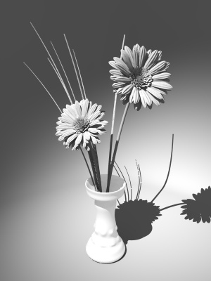 |
Image 3 - Colored radiosityNow, the unaltered radiosity-data. Notice the blue touch? The background mesh and the sky-sphere offscreen are of a blue color, and thus, shadows are teinted in blue. |
 |

Image 4 - Pure RadiosityShowing off the pure coloring effect radiosity has on the image. Notice the amount of influence on the colors of the flowers and the vase, but as mentioned above, the radiosity-lighting of the vase isn't visible in the actual image, since using rgb 0 (even with transmit values) cannot get any lighter than 0... Dependant on the gamma-settings of your screen, you may see a slightly darker patch running from the left side of the vase to the left edge of the image. Thats due to the curvature of the background-mesh. |
 |
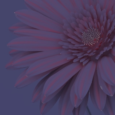 |
Image 4 - Close-UpClose up on colored pure radiosity-data. Here we can see more clearly the effects of scattered light. As you can see on single petals, they influence themselves pretty much. Even without a lightsource we can identify the flower and the single objects. |
Radiosity Conclusion
Radiosity, as can be clearly seen when comparing image 1 and 2, adds a lot to the lighting of the scene. But always do remember that this sort of lighting is dependant on the surrounding. You cannot simply switch radiosity on in a scene and get an enhancement. The scene must be modified to work properly.
Though similiar lighting conditions, especially for scenes as simple as this one, may be achieved without using radiosity and simply using the default ambient-lighting (which practically only takes care that shadows aren't completely black by lighting all surfaces with a dark gray, preserving original colors of the textures that lie in shadows), when looking at details and shadowed areas, you will perceive differences in the way a person looks at the image. Instead of going "How long did you take?", you might get a surprised "You didn't do that, did you?", implying that you might just have taken a photograph.
POV-Gibberish
For those interested, I used a technique Kari Kivisalo explained to me on the newsgroups. When saving the calculated radiosity-data to disk using the save_file option, you can smoothen radiosity artefacts by using a very low error_bound in the first trace, like .1, which calculates A LOT of samples. When loading that radiosity-data for the final trace, you use a error_bound somewhat higher, like .4. Its like simulating less detail in calculations by just averaging neighbouring samples. The results using that technique look pretty good, and on tests I did artefacts really were less visible. But be careful not to crank error_bound up too much. You actually "lose" more detailed data in advance for a smoother image. When smoothing too much, some nice details will just get blurred away.